
Like Pink? Great! Like Blue? Perfect.
Oftentimes my clients are part of a couple, wherein both will have their ideas of what they want their living space to be. Sometimes one partner will want a pretty, chic and airy space, and the other will want more of a darker, saturated or moodier environment. Which leaves me the challenge of taking those two perspectives and blending them into a cohesively designed room. Such was the case with the clients of the above furniture mock-up, but I have always had an appreciation for those two spectrums of design and love it when a space can meld them together into a successfully designed room. I couldn't wait to start storming up my brain for design ideas to present to them. There were some key pieces (couch, coffee table and chevron rug) my clients had already purchased ahead of starting the project, so that made for a fantastic jumping-off point for me. I knew, as well as my clients, that we wanted to create a space that exudes a subtle sophistication with rustic charm and luxurious chic. We've since started slowly putting all the pieces together and I'm anxiously waiting for the end result when I can share with you guys how it all came together. Stay tuned for that!
On to the blog topic of the day; pink and blue, but more specifically Pantone's Color of the Year: Rose Quartz & Serenity. If you clicked on the link you're probably asking yourself "But pink and blue are two different colors. Right?" Fret no more my fretting friend, your elementary color education has not failed you. 2016 will be the first year Pantone has chosen two colors, Rose Quartz & Serenity, a "warm, embracing rose tone, and a cool tranquil blue". Pantone announced this at the end of last year and since then, these two colors have been popping up everywhere in design, fashion and art. I was asked a month ago to weigh-in on a Georgia Straight article about the colors of the year so click here to check that out.
Pink has been having a moment in fashion and design for a couple of years now so it's interesting to see Pantone spotlighting pink with Rose Quartz but alongside the complimentary blue in Serenity. The combination of pink and blue is far from being a new one. Many designers have used these complementary shades to create movement and tension, as well as harmony and balance in their designs. Before I was asked to do the article I had not looked-up Pantone's chosen colors but when I did, I was not surprised by the inclusion of pink. I (maybe) even subconsciously chose the dusty rose swivel chair in the mock-up above and threw in those two blue poufs into the mix, because pink in particular has been in vogue lately. Truthfully, that fantastic swivel chair, in my opinion, just needed to be in this particular client's home, regardless of Pantone's color authority. I like that Pantone has chosen two colors that can read either dusty or airy, rather than bright and saturated. I often design spaces that are more neutral, but I am never opposed to using color that, as Chicago and NYC-based interior designer Kara Mann has said, have some depth and dirt thrown in. To incorporate these colors into your home, try pairing them with dark upholstery and warm metals like brass, bronze or black iron to balance the sweetness. For more ways to incorporate Rose Quartz and Serenity into your decor this coming Spring, I have collected some products and interior design inspiration for your viewing pleasure below. Enjoy! (cus how could you not?)


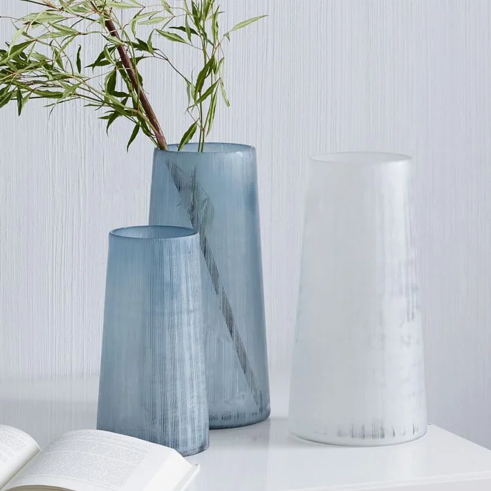


1. Roar + Rabbit Swivel Chair, West Elm | 2. Oliver Gustav Studio | 3. Frosted Mesh Glass Vase, West Elm | 4. Cloud Shade, Ochre Lighting | 5. Luke Irwin Norrland Rug, Anthropologie | 6. Yvonne Koné Boutique, Interior by Oliver Gustav Studio | 7. Luster Velvet Pillow Case - Dusty Blue, West Elm | 8. Interior by Steven Gambrel | 9. Rolling Cube Sculpture, CB2
Happy Valentine's Day everyone! Spread love, not cooties ;)